LA PURE | personal care brand
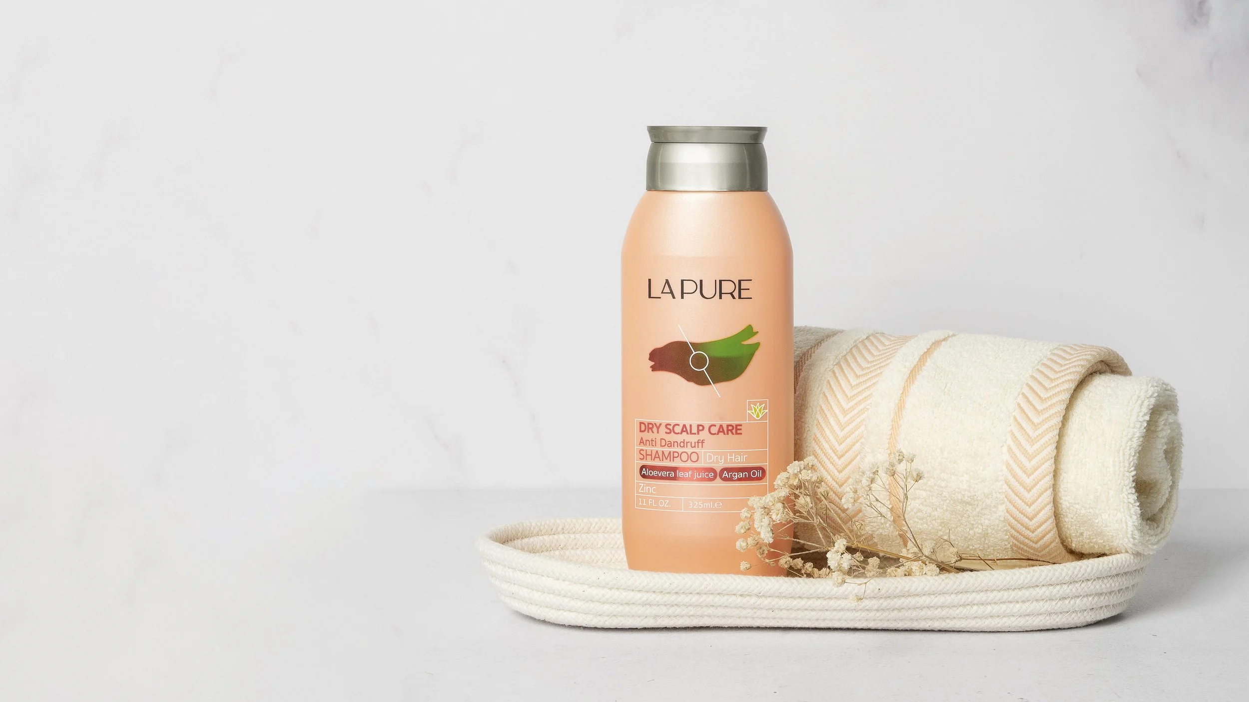
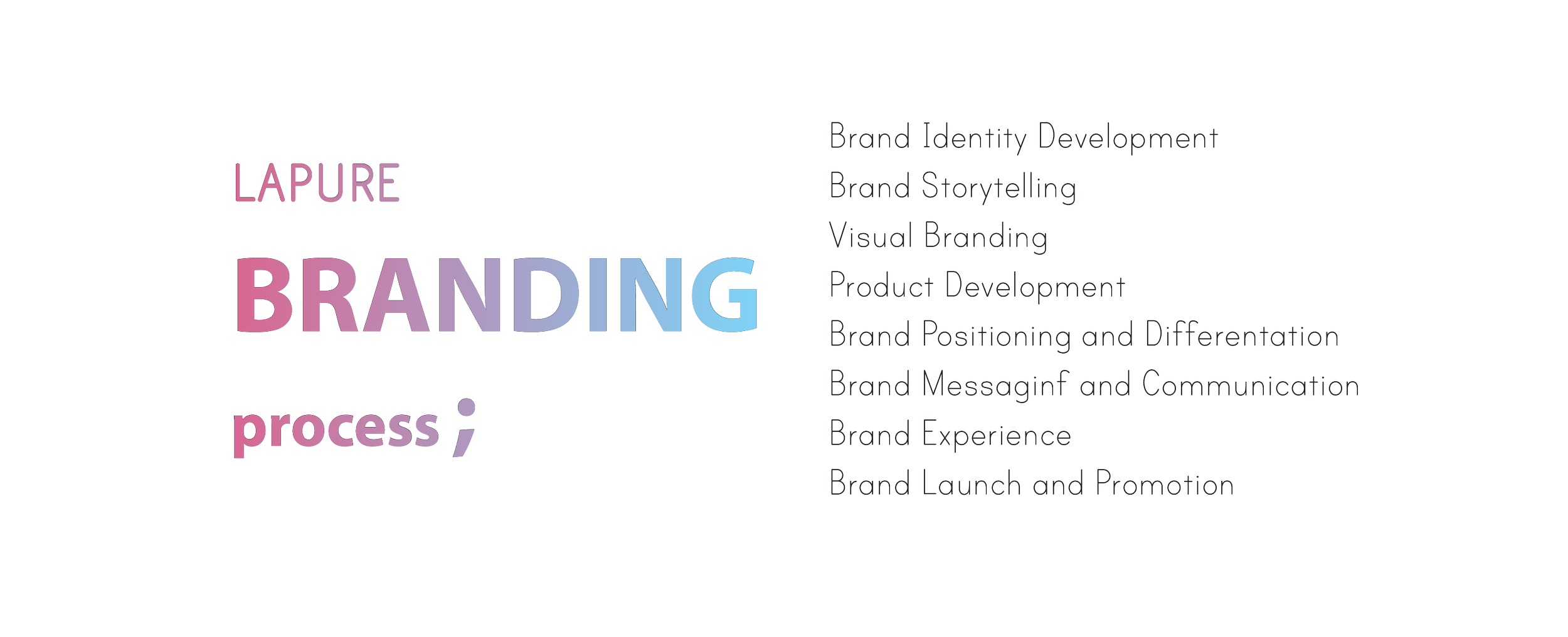
LAPURE is a high-end personal care brand developed by Golrang Industrial Group (GIG) in Tehran. GIG tasked us with creating a premium brand that could compete with international luxury and masstige markets. Our team oversaw all aspects of the project, including branding, packaging design, formulation, fragrance development, product selection, and ensuring the brand met international standards in both appearance and performance.
For the LAPURE project, we developed a premium personal care brand for Golrang Industrial Group (GIG) that could compete with international luxury and masstige markets. Our design approach focused on creating a sophisticated and modern look that reflects the brand’s high-end positioning. The packaging combined sleek forms, refined typography, and elegant aesthetics, ensuring that LAPURE met international standards in both appearance and performance.
My Role
As the Lead Industrial Designer, I was responsible for establishing and developing the brand's visual identity and packaging. My role evolved into that of a design manager and member of the board of directors as the project progressed. I led the design strategy, managed packaging development, and collaborated closely with various teams to ensure that LAPURE’s standards for both quality and aesthetics were met across all deliverables.
The Lapure products were successfully launched in 2023.
Role
Lead Industrial Designer
Phases
Brand Research, Concept Development, Brand Identity Creation, Packaging Design, Design Development, Visualization, Prototyping, Engineering Validation Testing (EVT), Design Validation Testing (DVT), Production Validation Testing (PVT), Batch Production
Credits
Nazanin Iravani | Design Director
Ramin Raoufi | Graphic Designer
Engineering Team | Golrang Industrial Group
Mold Makers | Golrang Industrial Group
LA PURE
Brand characteristics
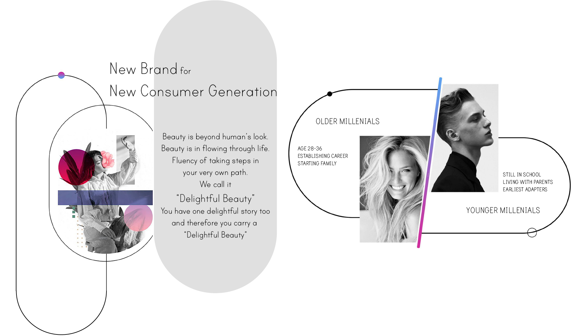
LAPURE embodies the essence of premium personal care, presenting beauty as a flowing, everyday experience. Designed to resonate deeply with its audience, LAPURE unveils the beauty inherent in each individual, fostering a sense of meaningful connection and self-discovery. The brand emphasizes holistic beauty, enhancing both inner confidence and outer elegance. LAPURE stands out for its purity and authenticity, offering a distinguished and genuine presence in the world of high-end personal care.
TARGET GROUP
PRODUCT BASKET
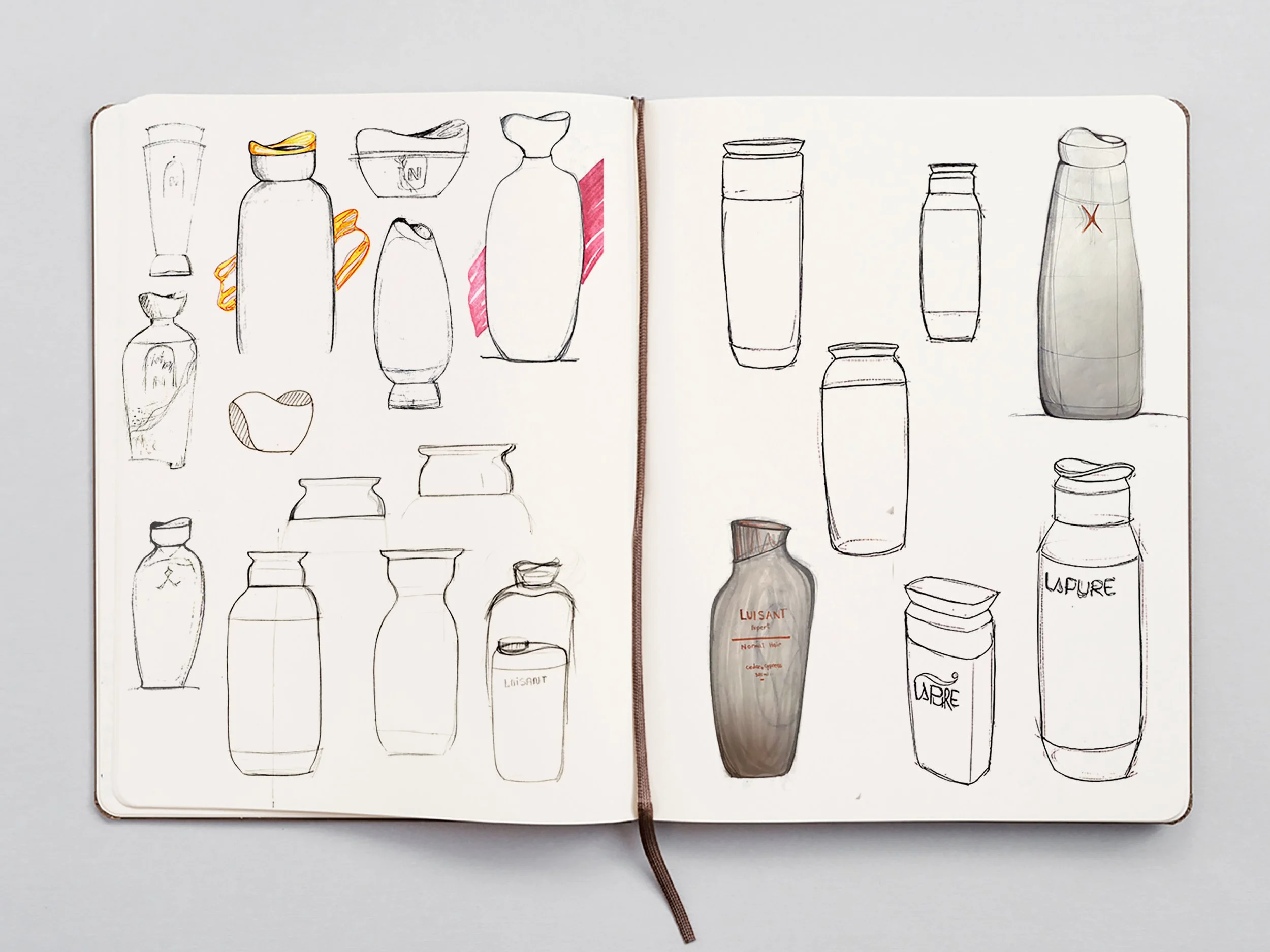
IDEATION
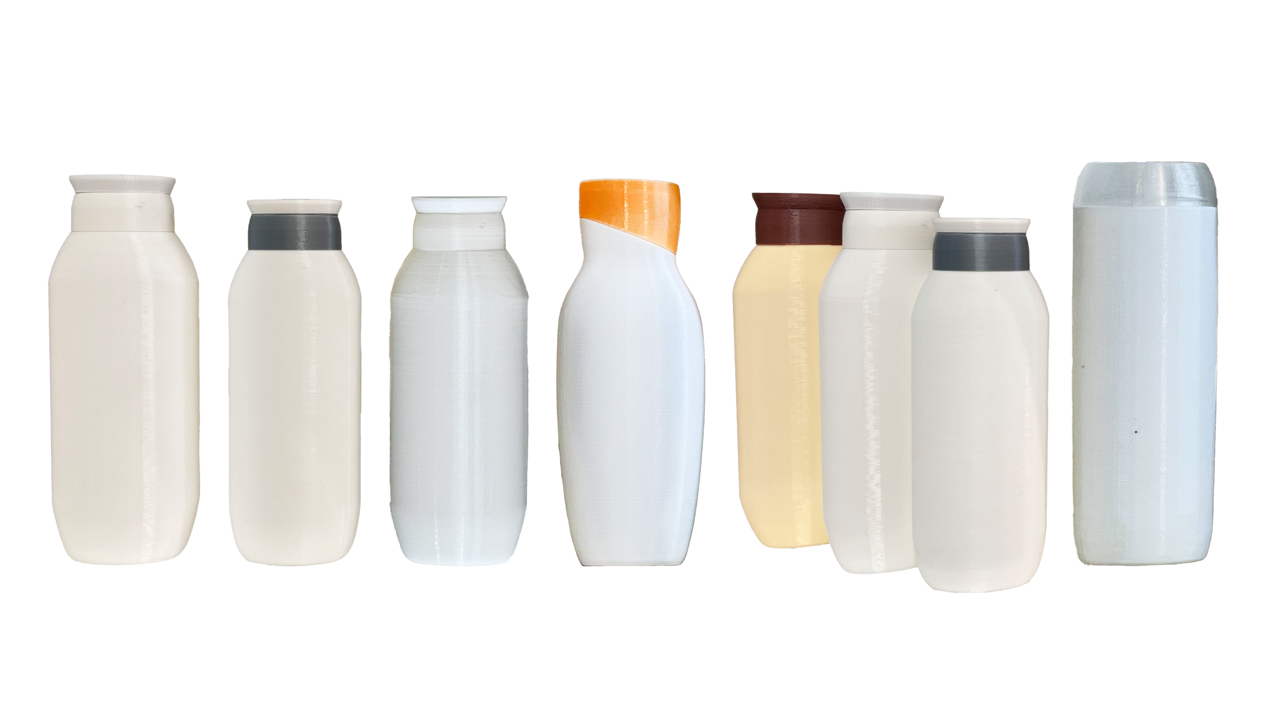
PROTOTYPING
FRAGRANCE
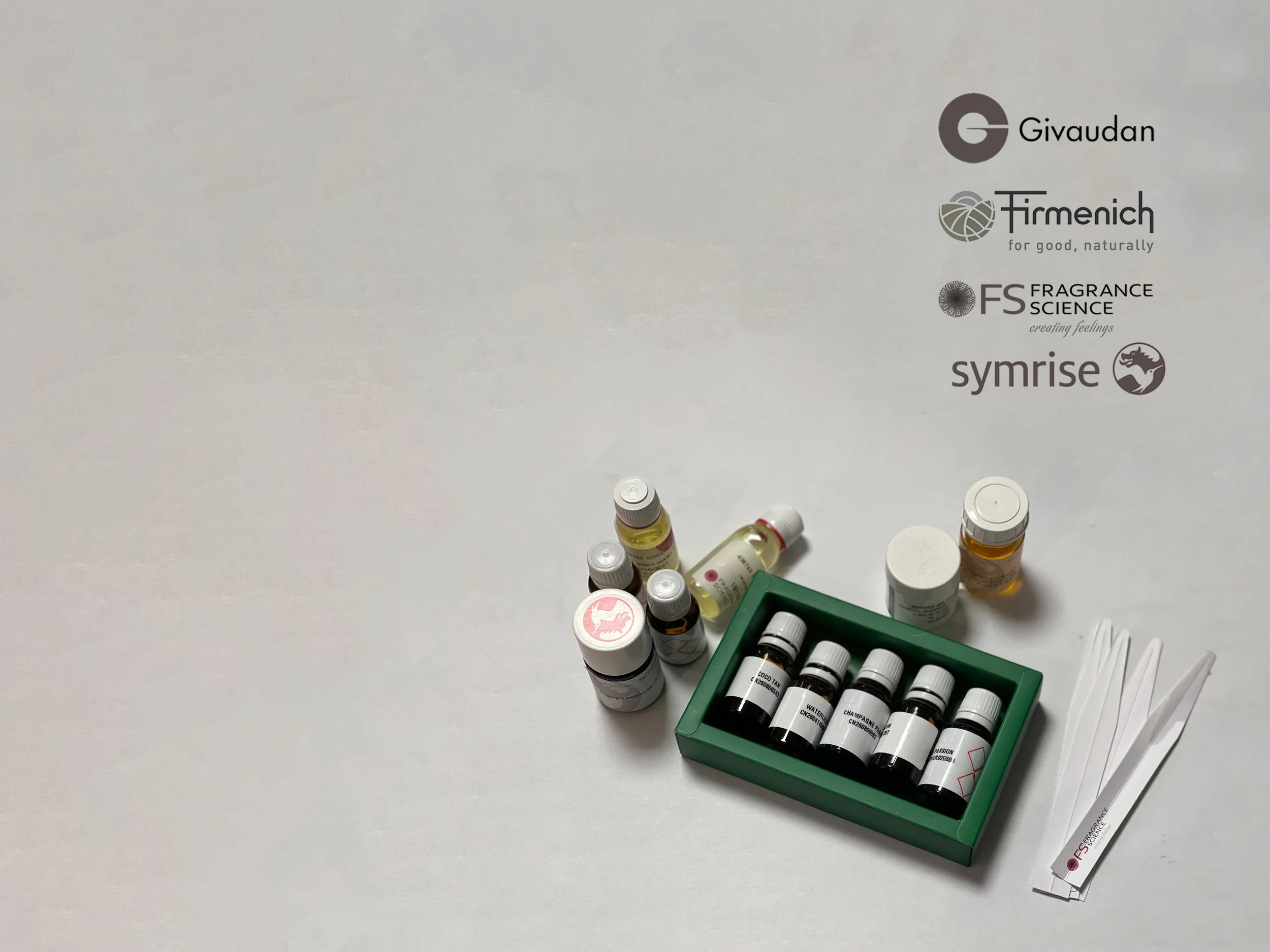
In this part, we went through fragrances according to the product's moods and characters and cooperated with some well-known international fragrance companies such as GIVAUDAN, SYMRISE, FIRMENICH, and FS. Then, we evaluated and chose the best matches with our concepts. The finalists were applied to our shampoo bases, and we evaluated their stability and viscosity through a test.
Point Of Sale Materials (POSM)
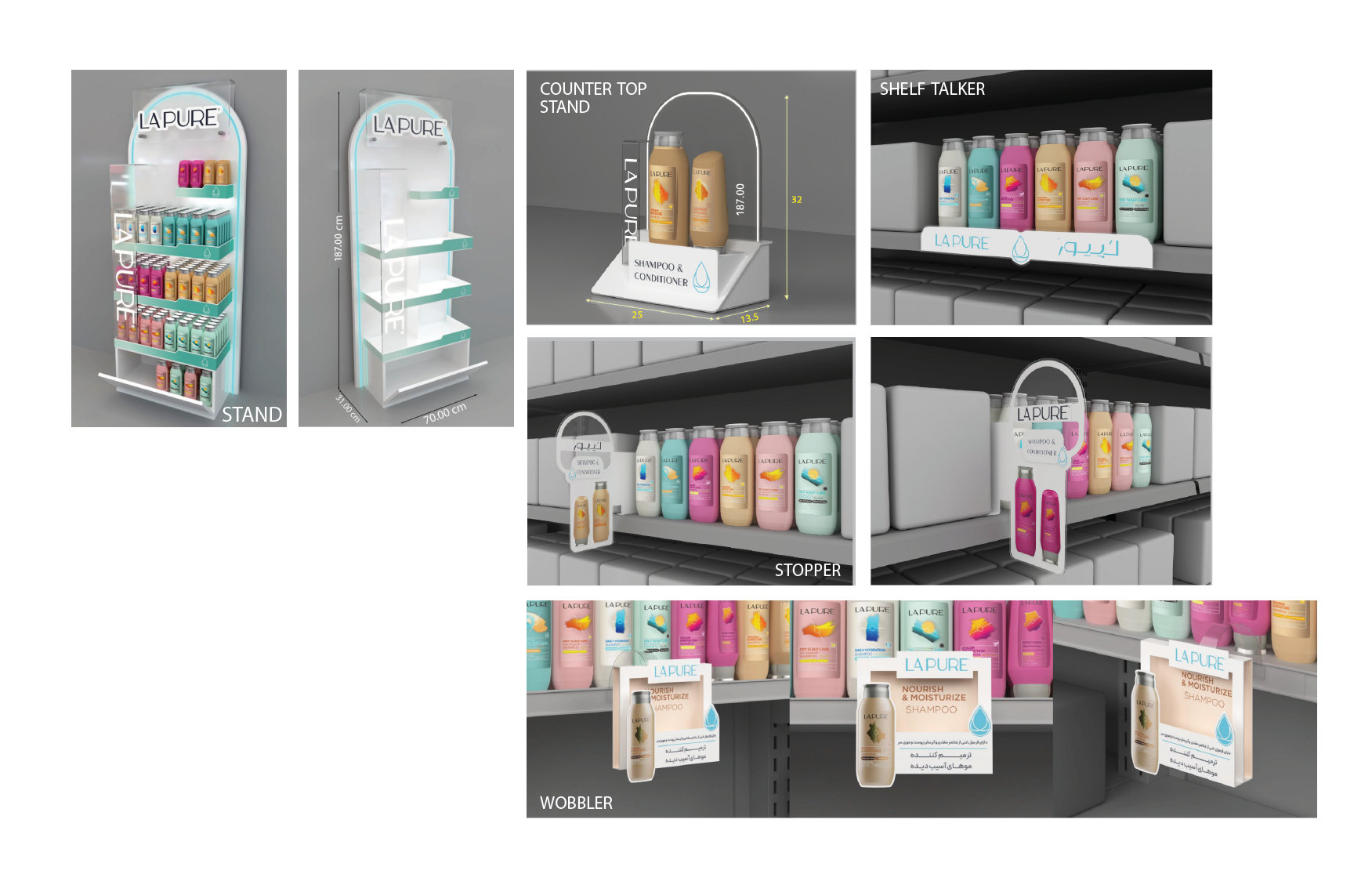
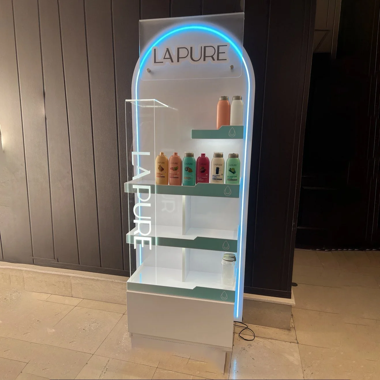
In leading the design process for "LAPURE" products, I was responsible for creating Point of Sale Materials (POSM) such as product display stands, counter top stands, shelf talkers, stoppers, and wobblers. I collaborated closely with manufacturers to ensure that every aspect of the design—including aesthetics, dimensions, materials, and details—met our high standards. This comprehensive approach helped enhance the brand's market presence and effectively communicated its identity to consumers.
FINAL DESIGN - hair care
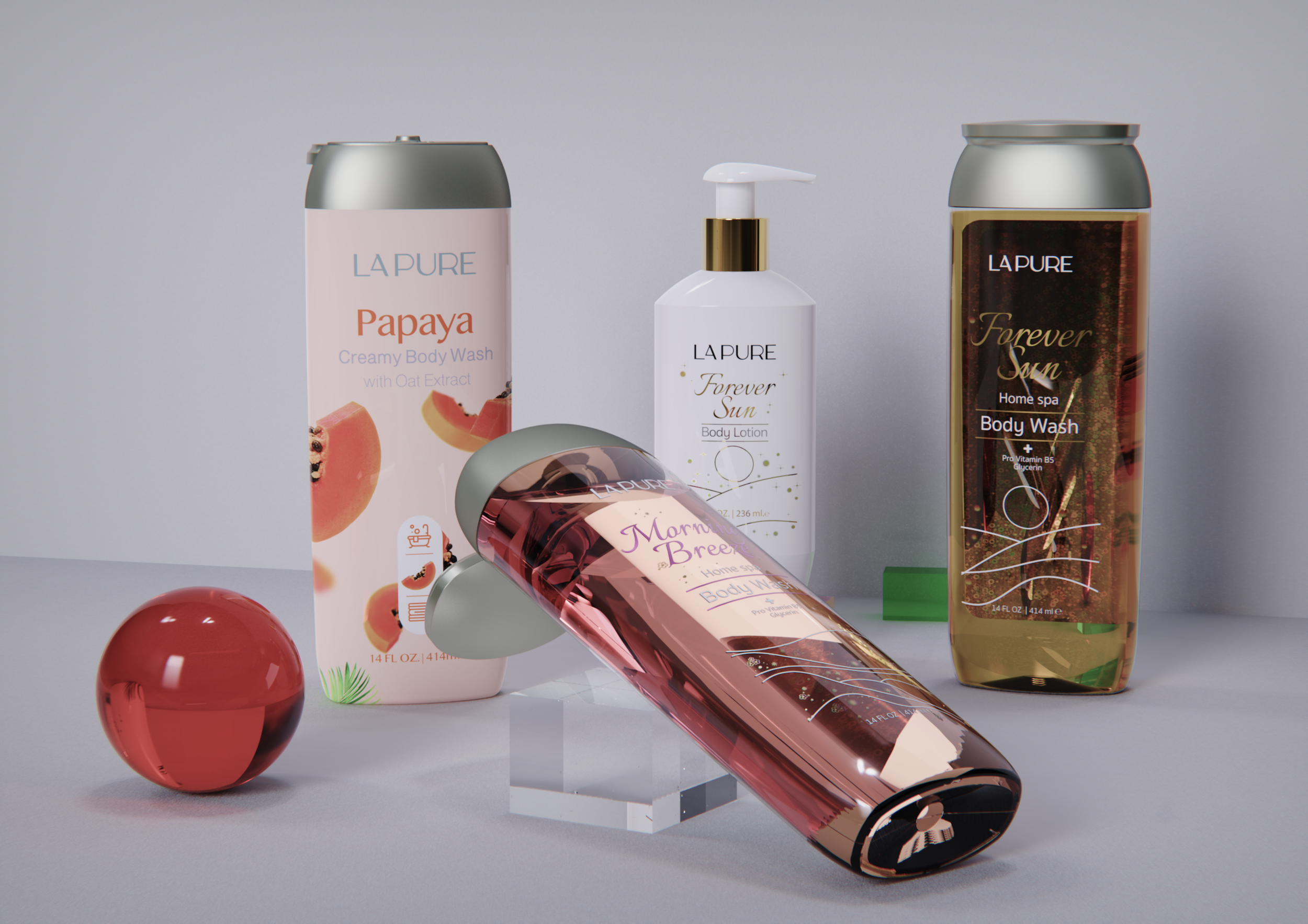
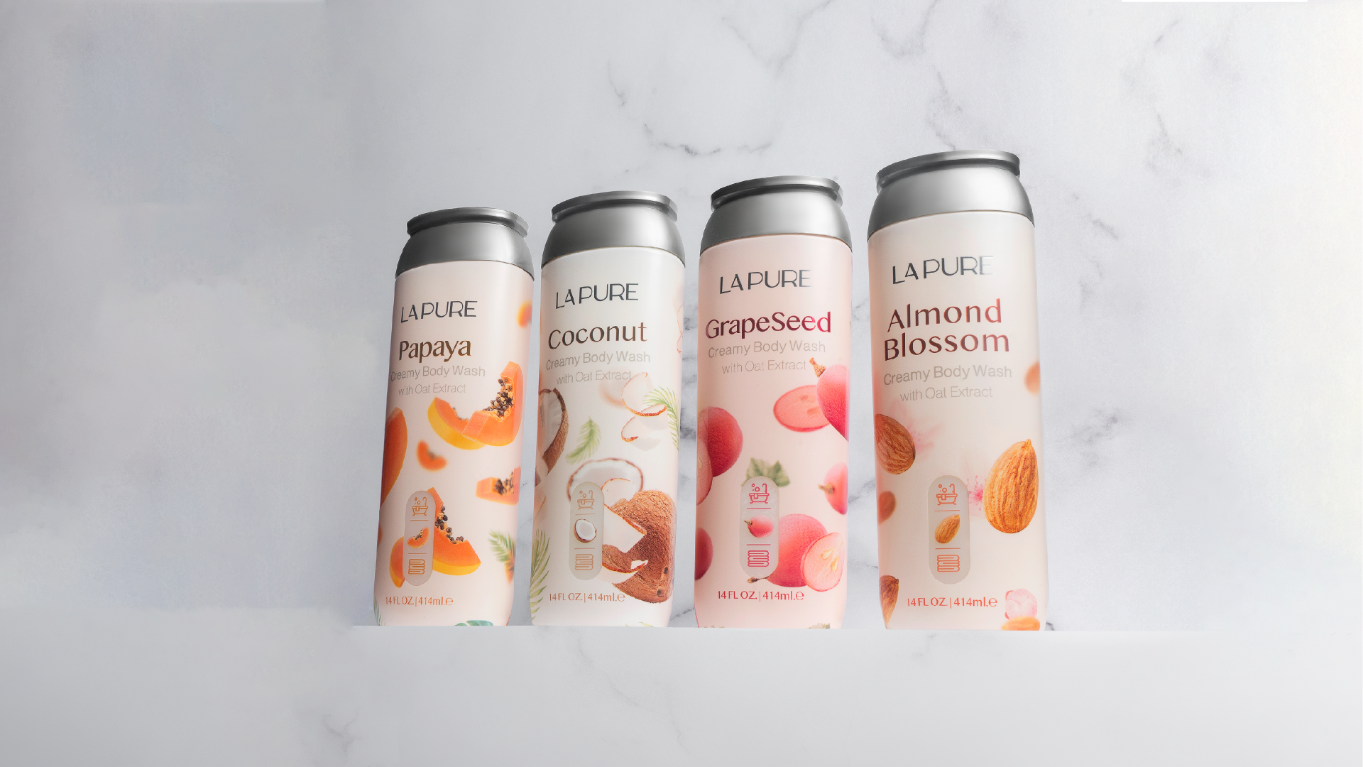
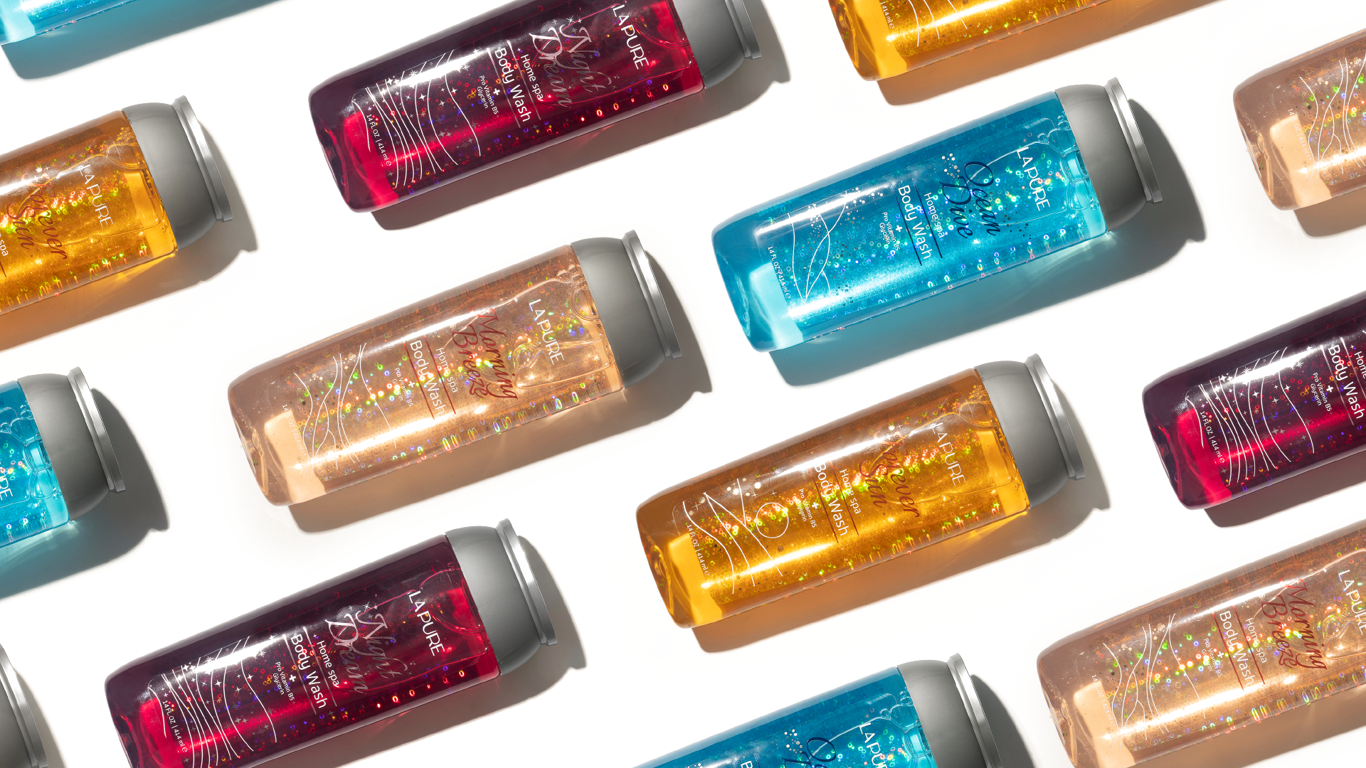
FINAL DESIGN - body care
Evaluation Phase: EVT, DVT, PVT
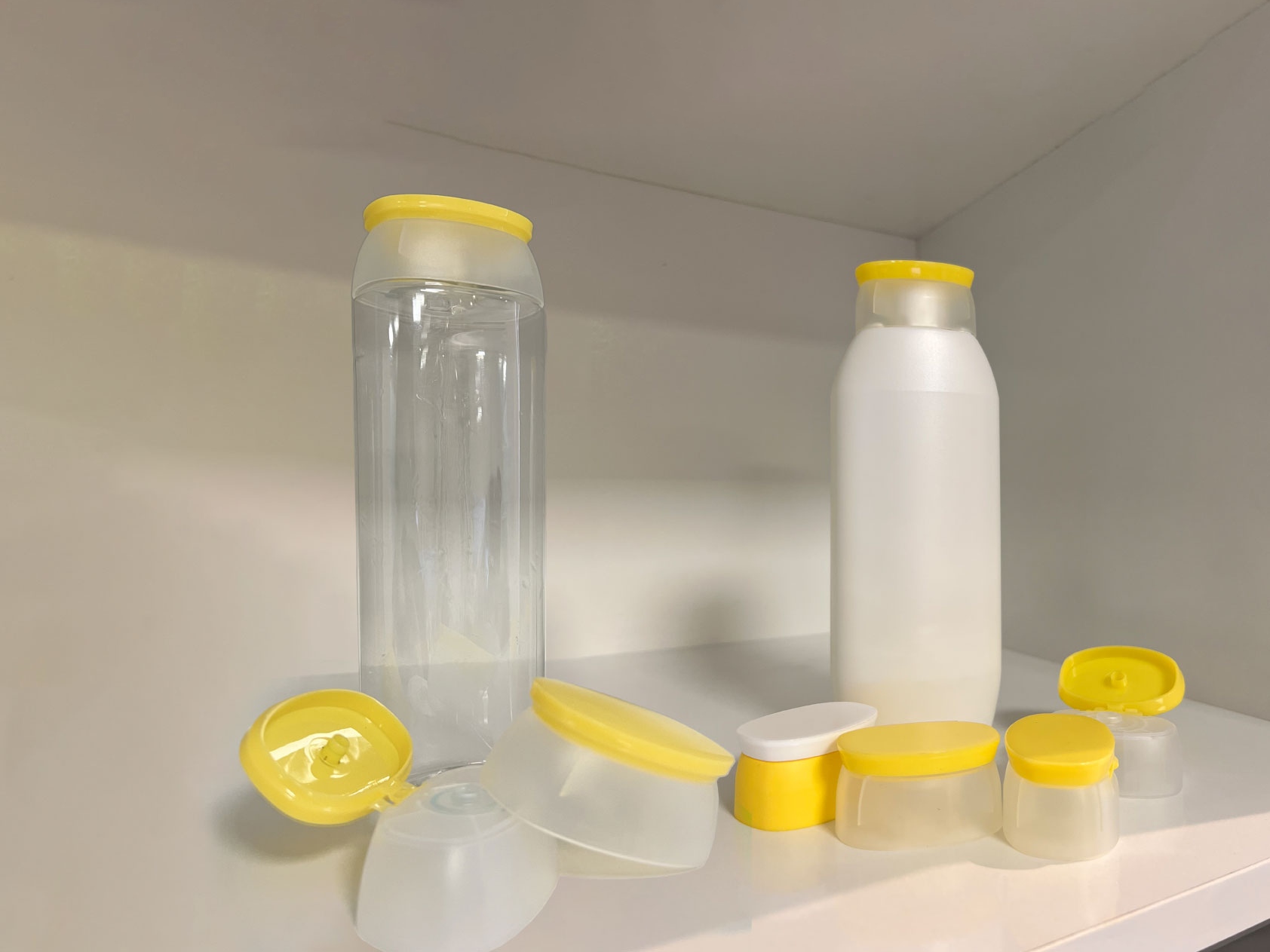
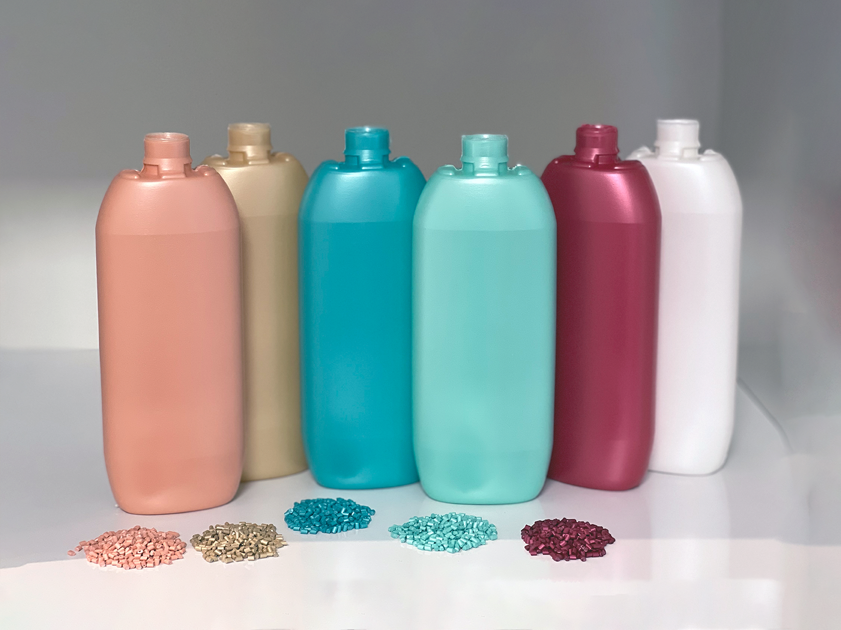
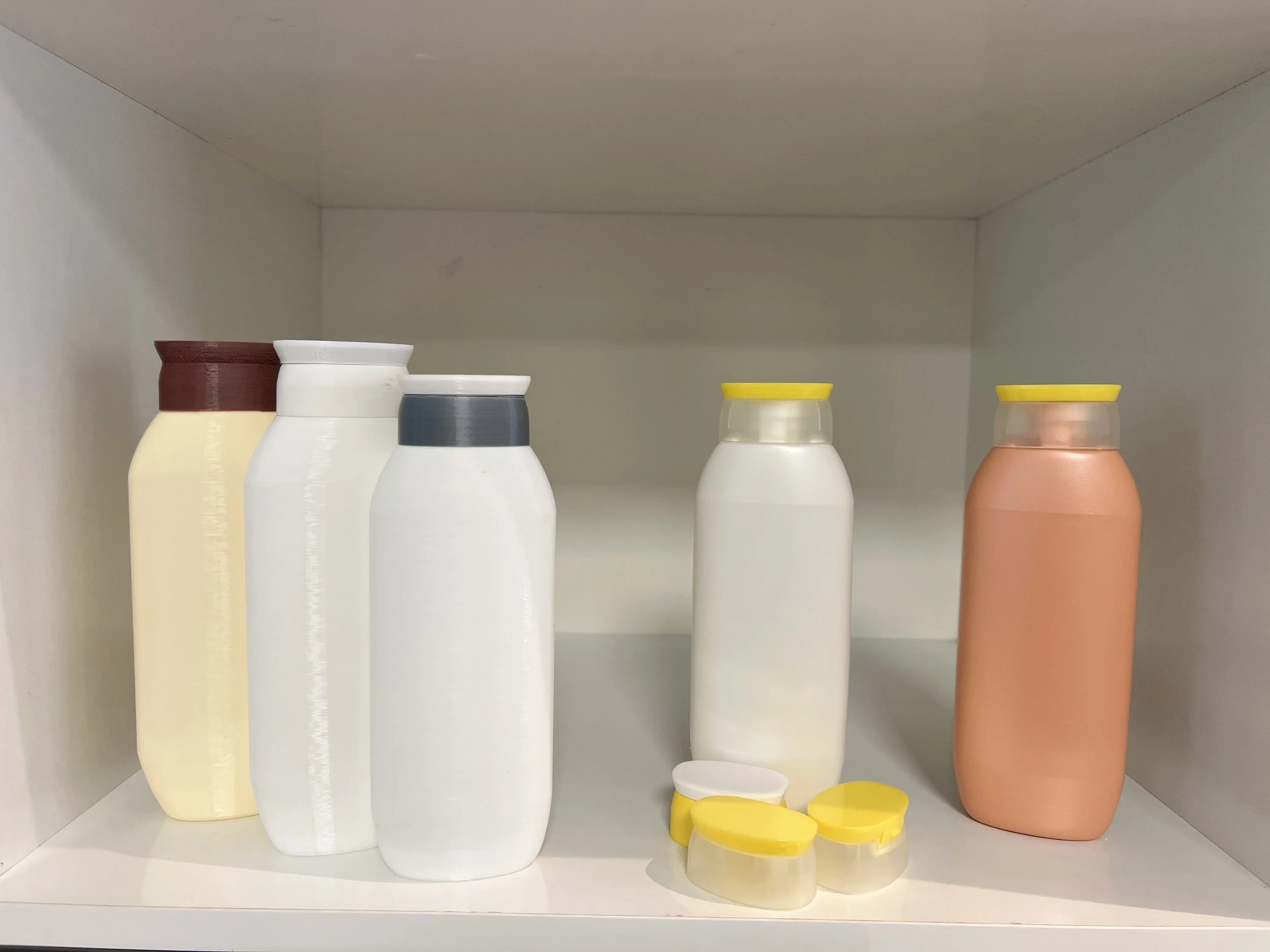
During the evaluation phase, the first batch of LAPURE bottles underwent extensive testing through Engineering Validation Testing (EVT), Design Validation Testing (DVT), and Production Validation Testing (PVT). This included testing the transparency of bodywash bottles, ensuring precise masterbatch color matching for hair shampoo bottles, and conducting rigorous cap functionality tests. Each element was carefully evaluated to ensure the highest quality and consistency across the product line, meeting both aesthetic and performance standards.
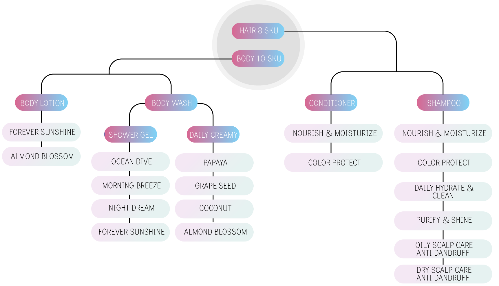
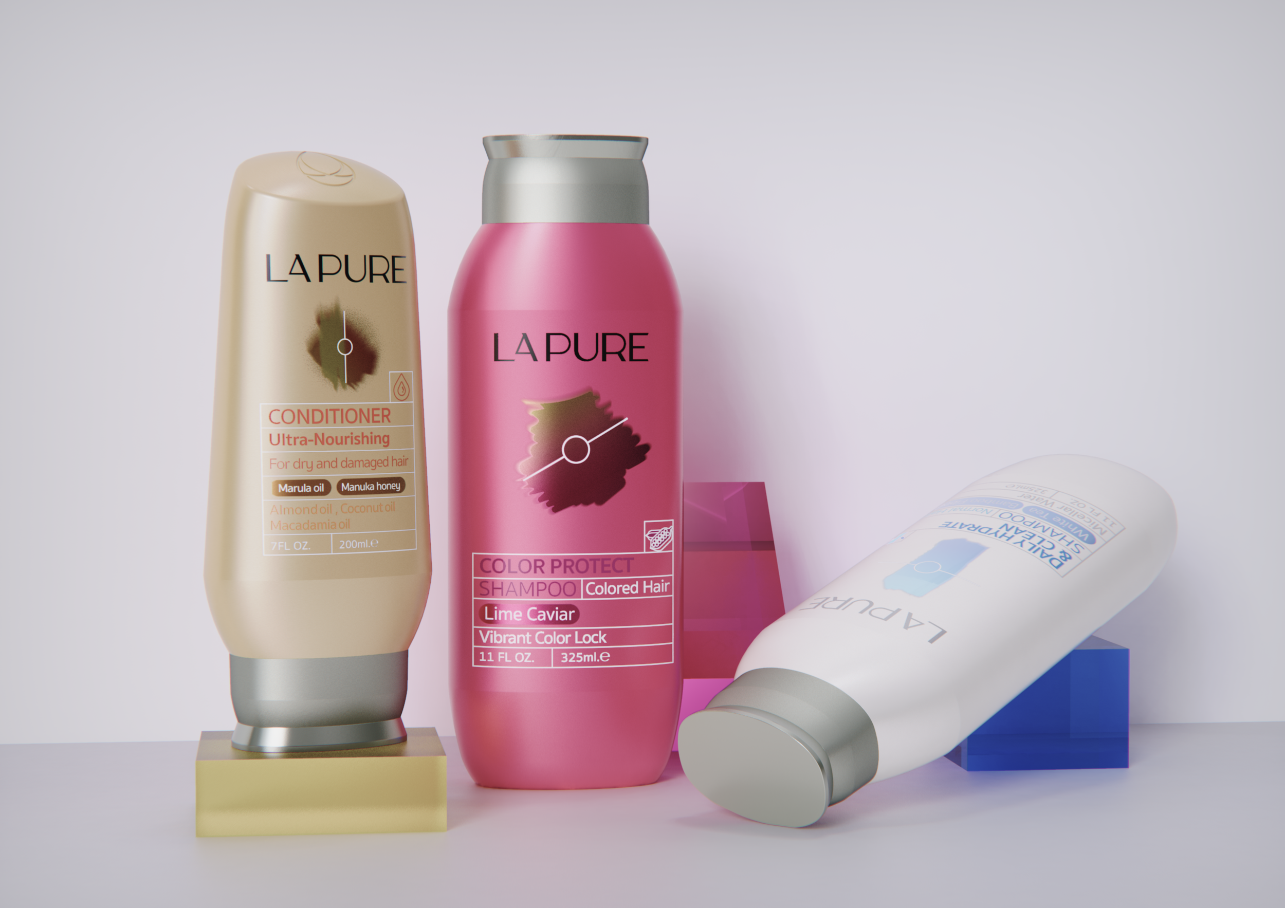
As the Lead Designer of the project, I focused on "BALANCE" as the core concept for the basic line. Each formulation was carefully developed to restore the natural balance of hair health. Additionally, the visuals were designed to reinforce and deeply convey the balance concept. A balanced line divides the illustration into two parts, symbolizing the transformation towards an optimal state.


